
CSS (Cascading Style Sheets) is used to control the style of a web document in a simple and easy way. CSS describes how HTML elements are to be displayed on screen, paper, or in other media. The process of writing a style sheet still lends itself to a few common mistakes among even the most seasoned designs. Here are the ten most common CSS mistakes that web designers of all experience levels commit.
1. ID vs Class in CSS
CSS has two attributes to declare the style for HTML elements: IDs and Classes.
An ID refers to a unique instance in a document, or something that will only appear once on a page. For example, common uses of IDs are containing elements such as page wrappers, headers, and footers.
On the other hand, a CLASS may be used multiple times within a document, on multiple elements. A good use of classes would be the style definitions for links, or other types of text that might be repeated in different areas on a page.
In a style sheet, an ID is preceded by a hash mark (#), and might look like the following:
#unique-element
{
position : relative;
margin : 0 auto;
width : 800px;
background-color : #000099;
font-family : Arial, Verdana, Helvetica;
}
Classes are preceded by a dot (.). An example is given below.
.non-unique-element
{
font-size : 12px;
margin : 5px;
display : inline;
}
2. Redundancy
Redundancy means writing repetitive code in your CSS. It’s a known fact that repetitively writing the code leads to wastage of time. Let’s look at an example:
.some-title { font-weight: bold; }
.some-other-title { font-weight: bold;  color : red }
We can group these together:
.some-title, .some-other-title { font-weight :  bold; }
.some-other-title { color :  red; }
3. Over-Qualifying Selectors
Being overly specific when selecting elements to style is not a good practice. The following selector is a perfect example :
ul #navigation li a { ... }
Commonly the structure of a primary navigation list is a <ul> (usually with an ID like #navigation) then a few list items <li> inside of it, each with its own <a> tag inside it that links to other pages. This HTML structure is perfectly correct, but the CSS selector is really what I’m talking about.
There is no reason for the ul before #navigation as an ID is already the most specific selector. Likewise, you don’t need to place li in the selector syntax because all the a elements inside the navigation are inside list items, so there is no reason for that bit of specificity.
Along these lines, you can consolidate that selector as:
#navigation a { ... }
This is an overly simplistic example because you might have nested list items that you want to style differently (i.e. #navigation li a is different from #navigation li ul li a); but if you don’t, then there’s no need for the excessive specificity.
Let’s assume that the navigation list is inside a header div (#header). Let ‘s also assume that you will have no other unordered list in the header besides the navigation list. If that is the case, we can even remove the ID from the unordered list in our HTML markup, and then we can select it in CSS as such:
#header ul a { ... }
4. Not Designing for Print Media Sources
Designing for the screen is only one component of what CSS is capable of. Indeed, using a separate style sheet for when a website’s content is printed can be an asset to today’s designers. It allows for the hiding of header, navigation, footer, and sidebar elements, and focuses exclusively on the written content. Like all good CSS applications, it creates a uniform way of printing content across browsers and platforms so that designers can ensure quality and consistency to their users.
Be sure to create a separate style sheet for print, named “print.css” that hides graphical or unnecessary elements when printing the page’s content. Insert that style sheet into an existing site using a “print” media type, and save the file.
5. Always Clear Floated Element
When a html tag end we should always try to clear the block element because we don’t know the element is floated or not. We have to avoid the overlapping element.
<div class=”clear”></div>

CSS
 .clear{clear:both}
6. CSS Mistakes while Background Image Attachment
While Writing CSS for background properties sometimes we forget its elements position. For Example:
background : url("img/bg.png") repeat-x scroll 0 0 #ba2a2a;
This syntax will work fine in all browsers but sometimes instead of background color we didn’t require any color, so we write our CSS like this
background : url("img/bg.png") repeat-x scroll 0 0 transparent;
This will work in all modern browsers but it won’t work on IE.
Correct placement which works in any browser
background : transparent url("img/bg.png") repeat-x scroll left top ;
7. Margin vs Padding in CSS
For most elements that have neither a border nor background color, margins and paddings can generally be used interchangeably. However, it is important to know the difference, as it will give you greater control over your layouts.
Margin refers to the space around the element, outside of the border. Padding refers to the space inside of the element, within the border.
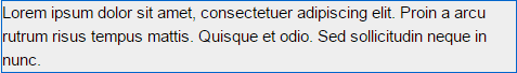
Example 1: No Padding, 10px Margin
p{border: 1px solid #0066cc; margin:10px; padding:0;}
Result :
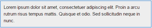
Example 2: No Margin, 10px Padding
p{border: 1px solid #0066cc; padding:10px; margin:0;}
Result :
8. Generic ClassNames in CSS
card .title {
color: #666;
}

.post .title {
color: #fff;
font-size: 1.5rem;
}
Now what happens if you place a card component within a post?
<article class="post">
<h1 class="title">Post title</h1>
<div class="card">
<h3 class="title">Card title</h3>
</div>
</article>
In this case, your card title will inherit an unwanted font-size rule from the post title. An easy fix for this particular case would be to use the child selector:
.post > .title {
color: #666;
font-size: 1.5rem;
}

.card > .title {
color: #000;
}
9. Liquid layout without a max-width
A liquid layout can be an awesome thing. But without a max-width the readability will suffer on large screens or big resolutions because the line length of the body Content will be too long.
#content {
/* max-width hack for IE since it doesn't understand the valid css property */
width: expression(document.body.clientWidth > 1000 ? "1000px" : "94%");
max-width: 1000px;
}
10. Using units for setting line heights
Using units when setting your line heights will make child elements inherit the computed value from their parent.
h1 {
font-size: 36px;
line-height: 48px;
}

.post-title {
font-size: 30px;
line-height: 44px;
}

.page-title {
font-size: 48px;
line-height: 72px;
}
With unitless line heights, child elements will inherit the raw number, and will be able to compute their own line height based on font size.
h1 {
font-size: 36px;
line-height: 1.5;
}

.post-title {
font-size: 30px;
}

.page-title {
font-size: 48px;
}
Submit your CSS Errors, issues or problems and get it fixed by an Expert Web Developer